AI Intelligence - Call Handling Summary
The Call Handling section provides AI-powered insights into the quality of patient interactions across your practice. It evaluates call performance using sentiment analysis and scorecard criteria, helping you understand how effectively your team communicates, resolves issues, and delivers a positive patient experience.
Scored Calls
What it means
Total number of calls that have been analyzed and scored by the AI during the selected date range.
Why it matters
This is the sample size underpinning all coaching and quality metrics — larger counts produce more reliable insights.
How practices use it
-
Ensure enough calls are scored to make reliable conclusions.
-
Track scoring volume changes after policy, staffing, or routing changes.
-
Validate coverage for coaching targets (e.g., minimum X scored calls per user/week).
Example
If Scored Calls = 312 this month, the AI scored 312 conversations that feed the coaching and sentiment metrics.
Customer Sentiment
What it means
An aggregated sentiment score derived from call analysis that represents the overall emotional tone (Happy / Neutral / Unhappy) across scored calls.
Why it matters
Sentiment is a quick indicator of patient experience and how calls make customers feel — a drop often precedes churn or increased complaints.
How practices use it
-
Spot deteriorations in patient experience earlier than complaints or reviews.
-
Correlate sentiment shifts with staffing, policy, or campaign changes.
-
Prioritize coaching where sentiment is low.
Example
If Customer Sentiment = 61 (aggregated), this indicates a moderate positive skew but worth investigating if trending down.
Overall Call Score
What it means
The average of all call-quality scores (based on the practice's scorecards) for the selected date range.
Why it matters
Gives a single-number view of call-handling quality across the practice and is useful for tracking improvements from coaching.
How practices use it
-
Set quality targets (e.g., aim for an average ≥ 75).
-
Measure the effect of training or script changes.
-
Compare across locations, teams, or shifts.
Example
If Overall Call Score = 68, that is the mean score of all scored conversations — use it to set coaching priorities.
Unhappy Customers
What it means
The percentage of scored calls where sentiment is negative (unhappy) out of total scored calls in the selected range.
Why it matters
High unhappy percentages indicate patient friction or poor call experiences that can reduce bookings and retention.
How practices use it
-
Drill into calls with negative sentiment to identify recurring problems.
-
Provide targeted coaching when a user has a high unhappy rate.
-
Use it as a KPI to reduce complaint drivers.
Example
If Unhappy Customers = 57%, then 57% of scored calls were categorized as unhappy — investigate causes (wait times, tone, process).
Happy Customers
What it means
The percentage of scored calls where sentiment is positive (happy) out of total scored calls for the selected range.
Why it matters
Measures the share of interactions leaving patients satisfied — a direct indicator of front-desk quality and service experience.
How practices use it
-
Reinforce behaviors tied to high happy rates in coaching.
-
Reward staff or teams with consistently high happy percentages.
-
Track how changes (scripts, staffing) affect satisfaction.
Example
If Happy Customers = 33%, then one-third of scored calls were positive — aim to increase this with coaching.
Customer Sentiment Breakdown
What it means
A chart showing counts (or percentages) of Happy / Neutral / Unhappy calls — a visual decomposition of overall sentiment.
Why it matters
Breakdowns reveal the distribution behind the aggregate sentiment metric, showing whether neutral or strongly negative calls are driving issues.
How practices use it
-
Prioritize root-cause analysis for large unhappy segments.
-
Monitor whether neutral calls improve to happy after coaching.
-
Compare sentiment mix across users or call types.
Example
If the breakdown is 25 Happy / 12 Neutral / 19 Unhappy, focus on reducing the 19 unhappy calls and nudging neutral calls to happy.
Scored Calls by Type
What it means
A chart showing number of scored calls grouped by call type (Scheduling, Billing, Clinical, Insurance, Recare, etc.).
Why it matters
Different call types require different skills; volume by type helps prioritize training for high-volume or low-scoring categories.
How practices use it
-
Identify which call types produce the most scored calls.
-
Tailor coaching content to the largest or weakest categories.
-
Allocate specialists for complex call types (billing/clinical).
Example
If Scheduling and Clinical dominate scored calls, focus coaching resources on those topics first.
Avg Scores by Call Type
What it means
Average call score for each call type — shows which categories have higher or lower quality on average.
Why it matters
Helps identify which call types need the most coaching and which represent strengths.
How practices use it
-
Run targeted training where avg scores are low (e.g., Billing = 29).
-
Replicate best practices from high-scoring call types.
-
Prioritize operational fixes for low-scoring categories.
Example
If Scheduling avg = 89 and Billing avg = 29, launch billing-specific training to raise quality.
Call Score Trend
What it means
A time-series chart showing average call score over the selected period (daily/weekly), highlighting rises or drops in quality.
Why it matters
Trend analysis exposes patterns and timing of quality changes — ideal for measuring impact of interventions.
How practices use it
-
Spot sudden drops tied to events (staff changes, system issues).
-
Validate if coaching improved scores over time.
-
Schedule refresher training when trend weakens.
Example
If the trend dips on Nov 19, check that day’s staffing or call routing to find the cause.
Scored Calls by User
A chart showing how many scored calls each user handled in the selected time range.
Why it matters
Shows sample sizes per user — necessary context when comparing user-level scores and win/loss metrics.
How practices use it
-
Ensure statistically meaningful comparisons (avoid judging users with very few scored calls).
-
Balance scoring assignments so each user has adequate coverage.
-
Reward users with sustained scoring volume and quality.
Example
If Holly has 93 scored calls and Danny has 12, treat Holly’s metrics as more robust and give Danny more scoring exposure.
Unhappy Customers by User
What it means
A per-user breakdown of unhappy-customer percentages (or counts) relative to their total scored calls.
Why it matters
Identifies which staff members generate the most negative experiences so coaching and remediation can be targeted.
How practices use it
-
Prioritize one-to-one coaching for users with high unhappy rates.
-
Compare unhappy rates to avg scores to see alignment.
-
Use call examples to demonstrate corrective behaviors.
Example
If User A has 59% unhappy calls and User B has 8%, focus coaching on User A’s interactions.
Overall Call Score by User
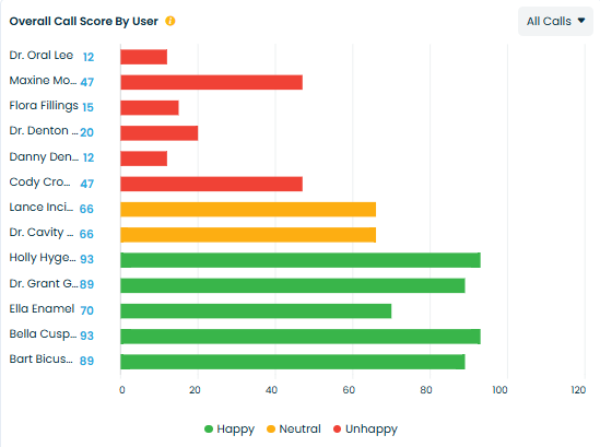
What it means
Average call score for each user — reflects individual performance against the practice scorecard.
Why it matters
Provides a way to compare user quality and identify who needs training or mentorship.
How practices use it
-
Create targeted coaching plans per user based on their average score.
-
Recognize high performers and extract best practices.
-
Monitor progress by tracking this metric over time after coaching.
Example
If Dr. Grant averages 89 and Dr. Denton averages 20, use Dr. Grant as a model and craft a development plan for Dr. Denton.
Related Articles
AI Coaching - Adit Call Intelligence
Overview AI Coaching in Adit Call Intelligence provides a complete view of how your front desk is performing on patient calls. It analyzes scored conversations, tracks coaching opportunities, highlights unhappy customer trends, and shows how ...AI Intelligence - Call Tasks Summary
The Task Handling module provides a complete overview of all automated tasks generated from call activity. These tasks help ensure timely follow-ups with patients, reduce missed opportunities, and maintain strong operational performance. This ...Calls overview - Adit Call Intelligence
Overview The Calls section is the central log of every phone interaction your practice has – answered calls, outbound calls, missed calls, and voicemails. From here you can filter call activity, review AI call analysis, and track how well your team ...AI Intelligence Overview - Adit Call Intelligence
AI Intelligence provides a complete, data-driven view of your practice’s performance across calls, opportunities, call handling, task management, and location-level metrics. This article gives a high-level overview of each dashboard before you ...Summary Dashboard Overview - Adit Call Intelligence
Overview The Summary Dashboard gives your practice a real-time view of front desk performance. It brings together key call intelligence metrics like new patient conversions, caller sentiment, call categories, and booking efficiency — all in one ...